How do you harness the energy of 95 people who would love to be outside, all-day and every day, if they could?

For one, build them a sweet bike room and locker facilities with showers. For two, create a beautiful space that’s filled with sunshine.
Truth be told, our team is pretty stoked to show up for work every day. When your job is making gear for what you love to do, motivation is pretty much baked into the workweek. Even so, when we built our offices in 2013, we wanted the building to be an inspiring place to come to. We wanted it to be a reflection or our brand and our team’s values.
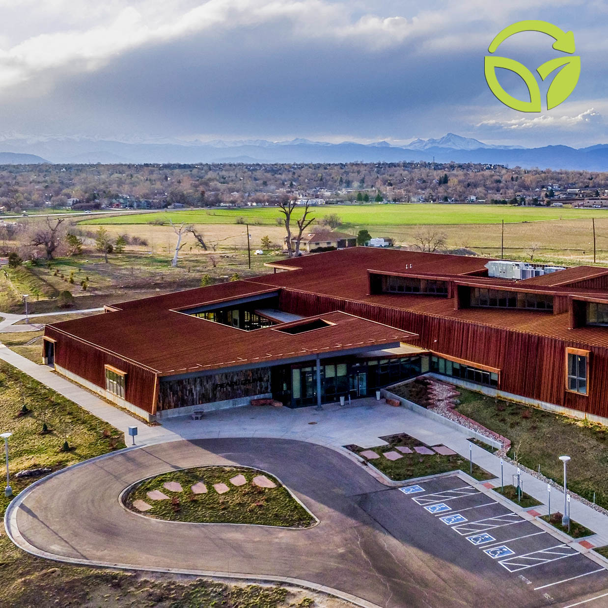
The new(ish) global headquarters are in Louisville, Colorado, about 10 miles east of Boulder and 22 miles due north of Denver. The 55,000-square-foot building was designed by Arch 11, of Boulder, and ZGF Architects, of Portland, Oregon. Between the two firms, they’ve earned 11 awards for our HQ alone. Not too shabby.
Low Impact on the Property
The location itself queued up the design of the building. It’s a low-profile structure that nudges into the gentle slope of the prairie landscape. The Boulder Flatirons–those famous, slanted sandstone formations that look like giant gatekeepers to the Rocky Mountains–dominate our view to the west. The building’s roofline mimics their dramatic angles. To the east is the open horizon of the plains, where we can watch thundering storms roll for miles.
Eleven rain gardens (aka catch basins) are situated strategically across the 8-acre plot. Their function is to catch rain and snowmelt before it runs into the paved streets of the business park. Layered with a specific system of sediment, rock and sand, the basins filter out motor oil and other impurities before the water seeps back into the native, underground aquifer.


Innovative and Minimized Materials
Our first challenge to the architects was to use less. Of what? Everything! Construction creates massive waste. What could we do away with?
The solutions led to an abundance of green features and an organic feel to the interior and exterior spaces.
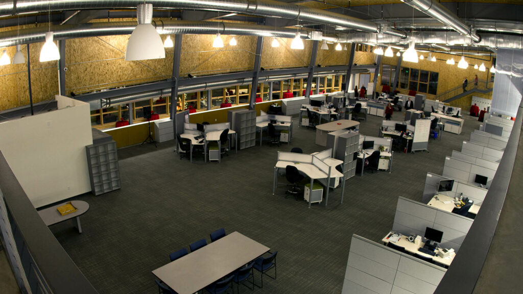
The walls are constructed with 10-inch, structural insulated panels (SIPs), which are wildly energy efficient. These SIPs panels are essentially the sheathing, insulation and interior walls in one tidy package. Typically, builders add drywall, tape, texture and paint to the interior. We simply didn’t. We omitted all of those materials, leaving the oriented strand board (OSB) of the SIPs panels as our interior walls and saving tons of excess waste. Plus, we liked the warm look of the wood and we’ll never need to paint the walls.
Continuing with the minimalist theme, all of the functional aspects of the building are exposed. There are no drop ceilings to cover the ductwork, plumbing and electrical. With their work on full display, the contractors were mindful of every nail, screw and wrapped duct that was now architectural features.
The roof and exterior siding of the building are a gorgeous earthy brown color that didn’t take a lick of paint. It’s all recycled steel that’s been allowed to rust to a complete patina. Moving forward, there will be little to no maintenance. As a nod to our home in the West, the aged wood of the main entrance is repurposed from Wyoming highway snow fencing.

A Healthy Social Environment
Our second challenge to the architects was to create spaces that fostered collaboration but also allowed for focus. Shout out to our introverts and extroverts: we love you all.
Overall, it’s a highly interactive space, with only four official offices. (You know, with a door and everything!) The openness can feel like a beehive of frenetic activity – with sewing machines from the prototype shop setting the soundtrack for the day.
Remarkably, it doesn’t take long to find the harmony among the chaos. In this environment, people are really approachable. We literally see what our colleagues are working on. Those of us in the operational side have a more direct connection with the craftsmanship of our product because we’re watching these incredibly skilled artisans create and refine it by hand. The openness lends itself to a mutual appreciation and support. It has helped to build our sense of camaraderie.
While the people inside are the true spirit of our offices, certain architectural details help to foster that positive social interaction. Namely: windows. There are huge south-facing walls of windows that capture the sun’s radiance and light. And the one-up over most office buildings? Our windows open.
Pause for a moment of appreciation (and fresh air).
For whatever reason, operable windows are rare in business environments, yet they immeasurably improve morale and health. Even better, some of our windows automatically vent to maintain healthy air quality. If interior CO2 levels reach a certain point, these windows open to allow the stale air out.
When a full dose of fresh air is in order, it’s time to visit the courtyard nestled within the structure. Louisville is not shy on wind, yet somehow this space provides a calm space from the often wild Colorado weather. As one of our team members said, “It’s like our own little snow globe during the winter.”
One of the best aspects of the property has little to do with the actual building. We selected this location, in part, because of the proximity to one of the most comprehensive bike trail systems around. With a 300-foot connecting path from bike room to the trail, bike commuting and lunchtime rides are literally right out the door.
Buildings can foster visceral responses and they can foster physical wellbeing. Ours does both. The functionality of the space has become its own art, and the minimalist approach eliminated untold amounts of waste and toxic construction materials. It is truly an inspiring place to arrive at every morning…hopefully on two wheels.


Comments